Anna-Grace Agnini Photography
Project Description:
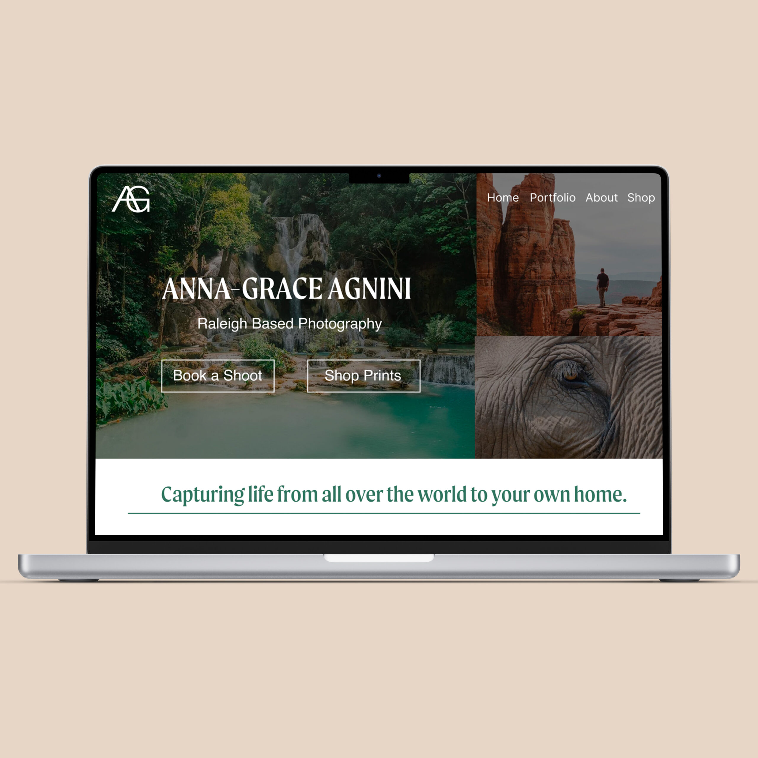
Website redesign based in strategy for Anna-Grace Agnini Photography.
Before
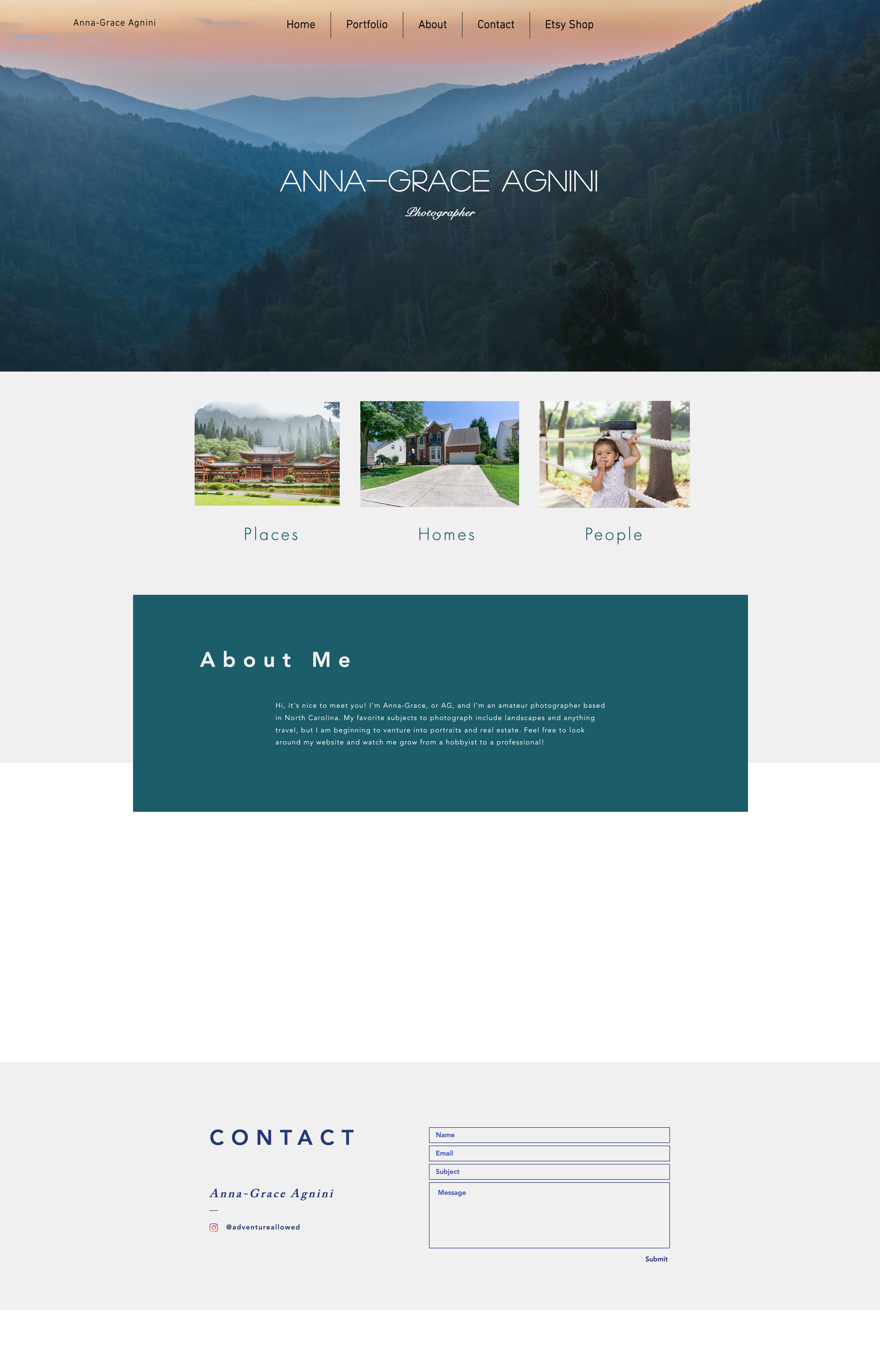
Redesign
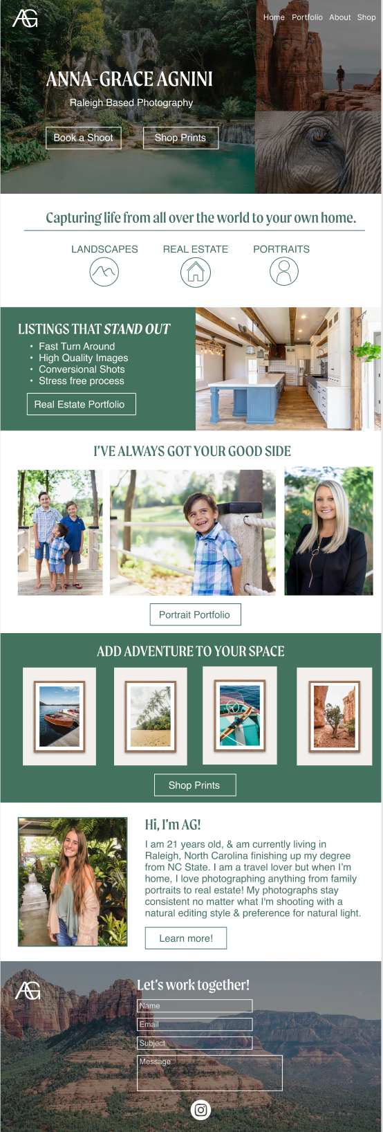
Before
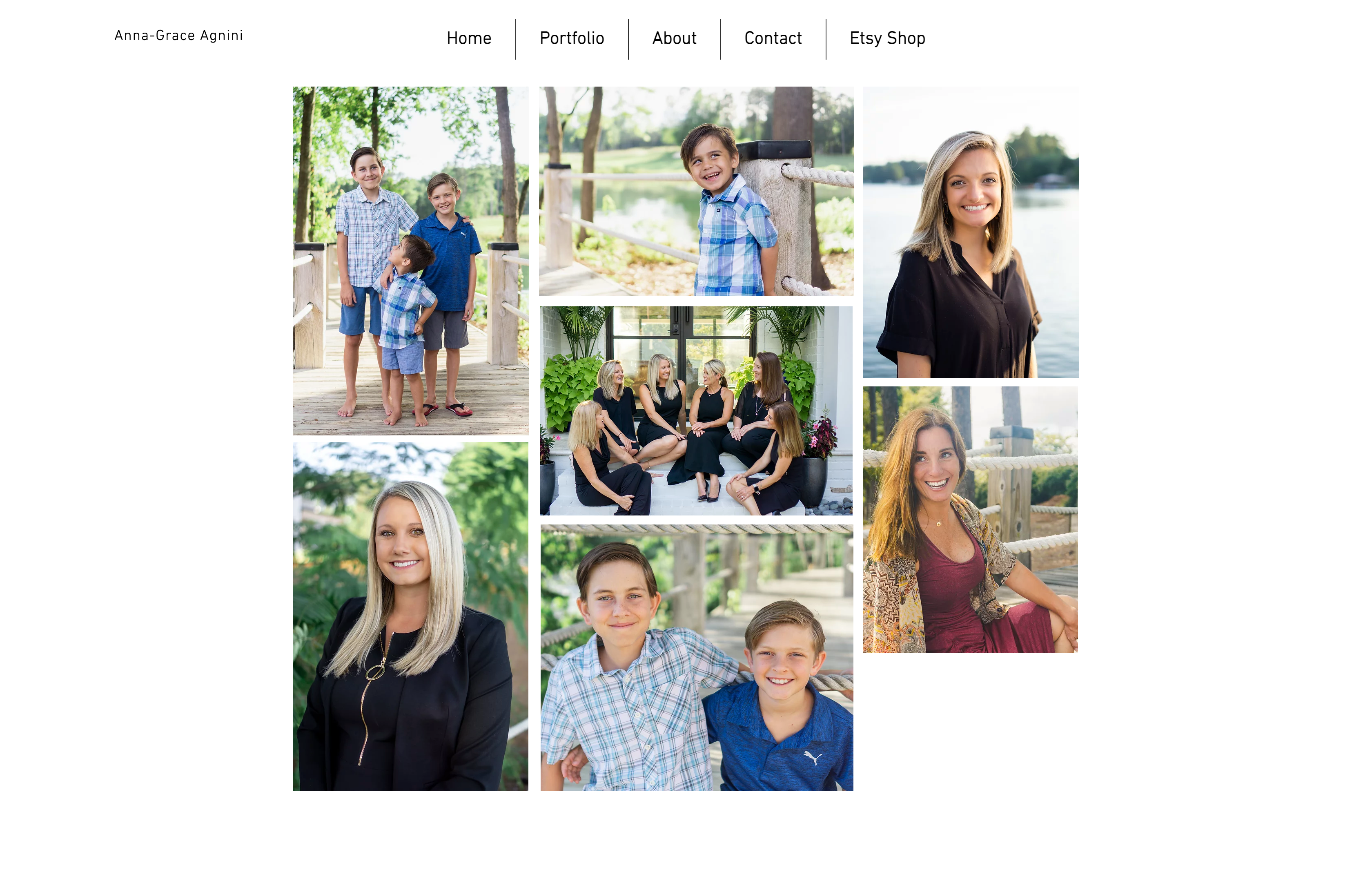
Redesign

Strategy
Main Objective
The objective of the website will be to target customers that want to purchase photoshoots specifically real estate and portrait photography or purchase travel prints. This website will act both as a portfolio to display her photography and be a place where users can purchase Anna-Grace’s products and services.
UVP
Anna-grace specializes in 3 types of photography: Landscape, Real Estate, and Portraits. She uses her photography talents to capture photos all over the world including right at home. Throughout all of these different types of photography, her style stays consistent by providing a natural feel through natural lighting and editing. Her primary specialty is landscape photography which inspires others to see the world.
Slogan
Capturing life from all over the world to your own home.
Call to Action
These are the primary actions Anna-Grace Photography wants customers to take: Book a Shoot (Contact Me) AND Shop Prints
Target Audience
Home listers, real estate professionals, customers who want portraits, customers looking for travel prints to decorate their homes. The primary target audience is females 25-55 years old specifically near Raleigh where Anna-Grace photography is based.
Look & Feel
- Natural: The colors, text, and main images will create that natural feel that anna-grace likes to capture. Green will be the main color that represents the environment, life, and all things natural. The images on the home page will be vibrant and immediately impress the viewer. The emotion generated from the images chosen should drive action.
- Friendly: Copy should come off friendly and not corporate, but still professional. Images should also be friendly. A photographer is someone who a customer will spend a lot of time with, it is important to create a personal connection through the website in order to establish that Anna-Grace is someone a customer would want to spend time with.
- Simple: The website will include many photographs so the copy and additional colors should stay simple as to not overwhelm the user. Functionality is most important as the main objective is to guide the customer from the home page to purchase a product or service. The target audience is less worried about website aesthetics and more worried about how the service or product benefits them.
- Professional: As an amateur photographer in a competitive industry, it is important to show Anna-Grace’s professionalism in order to reach new clients and gain more experience.
Specific Improvements to Current Website
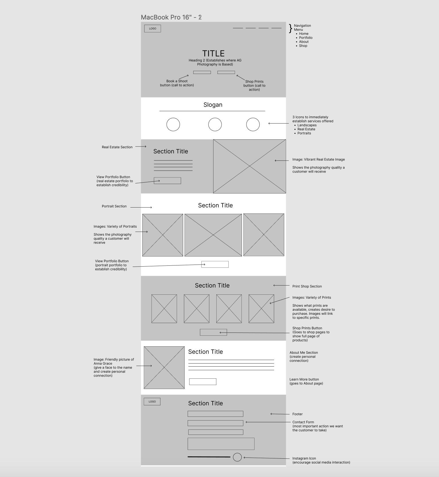
- Clear Call to Action and UVP above the fold
- It is important that a user immediately understands what Anna-Grace Photography offers before scrolling or moving off the home page
- Create logo for consistency and professionalism – no current clear logo
- SEO
- Page titles, headings, and copy should be optimized
- Additional internal links on home page, portfolio pages, etc.
- Include “Raleigh” in copy as the target audience will be searching for photography near them.
- Optimize image alt tags – take advantage of the large number of images on the website
- Brand colors are currently unclear and inconsistent across pages. We will make it simple using one accent color: green. Photographs will add more colors.
- Add CTA to portfolio pages to guide the user to book a photoshoot or purchase a print. This will allow for better functionality and more internal links for SEO.
- Contact Me Form will be in the footer on every page as this is the most important action we want the user to take.
- Easy to read text
- Currently unclear where Anna-Grace Photography is based, this is important to emphasize for the target audience.
Wireframe
